App Design and Prototyping Process
For the past two weeks we have been working on App Design in XD. The project was design an app we’d like to use and create a prototype to showcase features and productivity.
Our first step was to come up with an idea and pitch it to our instructor. I chose my app based on the gaming community I am apart of which has come across a need for better communication when it comes to upcoming games and events. Inspired by an app we use for our child’s school and classroom communications, I decided there was a need for something like that is for groups outside of schools.
The second step required sketching it out. We needed at least 4 screens showing main elements like buttons, input fields, and text. We had to draw lines linking pages together for a rough idea of how the app would function. We were to also include a Splash page and an Error page.
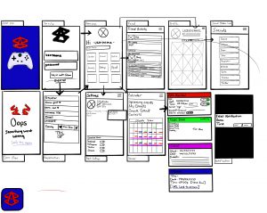
While this wasn’t technically part of the assignment it was obviously necessary for the next step. We had to build a wireframe with the elements included (I guess they figure we’ve got this step down by now) in order to begin the prototyping process
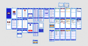
This project got a bit out of hand for me. Every idea I had required a new screen. Essentially what I’ve come up with is a social application where community members can share info in an environment catered to them. While the potential for this app is not limited to gamers, that was what I started with because this is something I feel the community I am apart of could and would use,
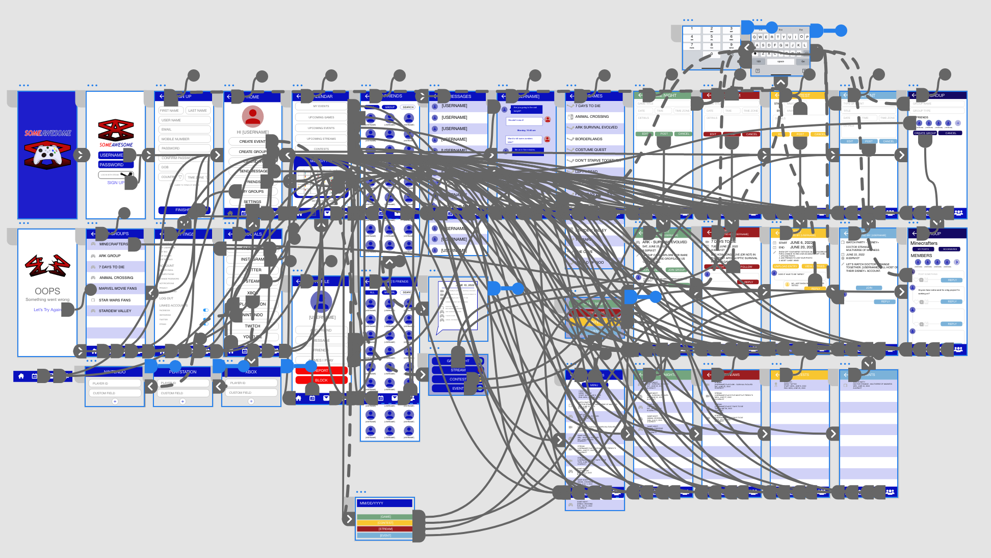
Step four was the fun part. Actually connecting the pages and creating the functionality of the app brought it to life. And while it doesn’t actually work, it felt like it did.
The prototype phase looks like a mess. A complex web of lines connecting pages to pages, to overlays, to links. My respect for app designers has skyrocketed during this assignment!
And here it is, the demo of my app prototype. Like I said, I really enjoyed this assignment, and while I’m not sure how to code it (yet) it was really cool seeing it in action.
Intro to UI/Ux
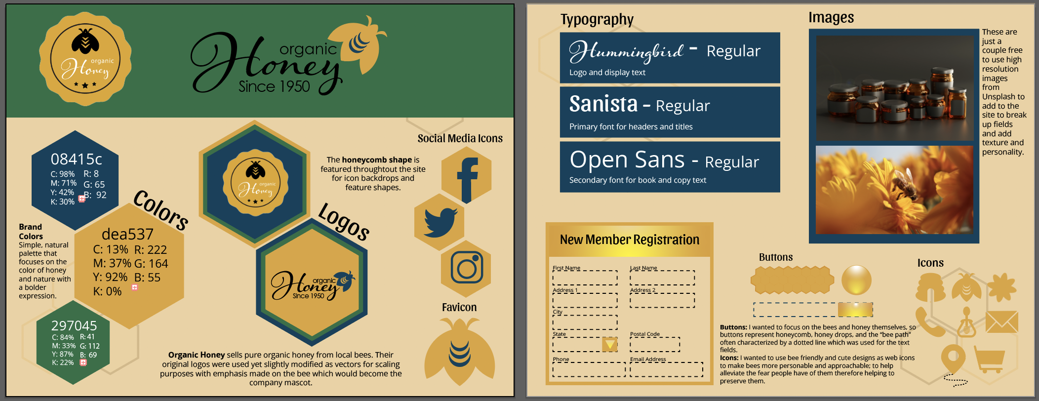
We’re in the front end web design portion of our course which means working on Xd to create wire frames, presenting the client with a style guide, and hi-def wire frame of their web site.
In this assignment, the client was Organic Honey, a (fictitious) local honey farmer looking to have a web presence.
THE PROCESS
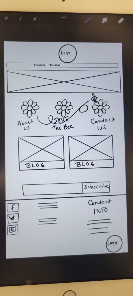
Sketch:
Wireframe:
Mobile (not required):
Style Guide:
Hi-Def Wireframe:
Logos:
What I was given
What I recreated:
Programs Used:
Adobe Illustrator
Adobe Xd
Back to Portfolio
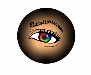
Plain Sight Gems Logo Design
A fellow student and musician was looking for a logo for their band Plain Sight Gems. I am always on the hunt for experience. Our mutual instructor put us in touch and we fleshed out a new project.
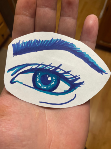
He gave me a sketch of the logo they wanted to use, and mentioned that they wanted a gemstone used for the pupil of the eye, and a colorful and psychedelic type of pattern for the iris. They also wanted the band name incorporated.
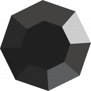
Eyes are my favorite feature to try to replicate so I enjoyed the concept of this design. I started with the pupil. I figured a black onyx was the obvious choice.
I thought the best idea was to design a top down view of the stone, using the diamond cut angles to create the shadows and give it depth. I believe this gave it a very realistic look I was happy with.
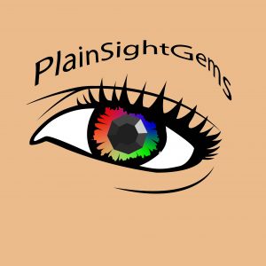
For the most part both of us were happy with the design this far. I had decided to use the band name as the eyebrow to give it some extra detail while adding more detail to the eye concept. It’s a subtle detail but I think it makes a big difference. He liked the idea too, but wanted more of 70’s “hippie” font used for the band name. I agreed.
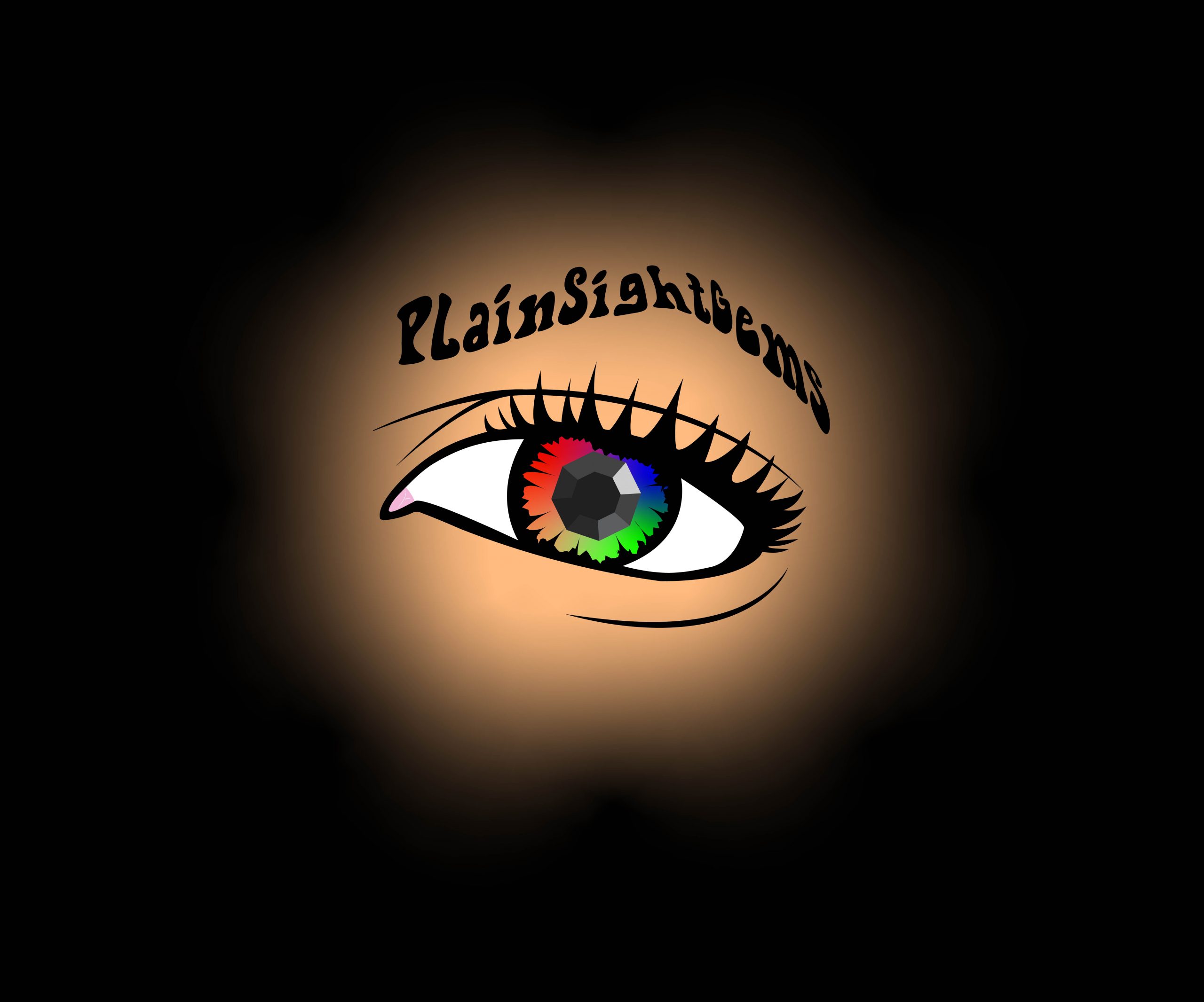
He also wanted a black background, but with all the black detail in the outline of the eye I had to advise against it. We decided to give it a flesh tone background for contrast, and then played around with some ideas of it peeping through an eyehole or something to that effect. After some trial and error we were both happy with the final result.
It was a lot of fun working with another student. Taking their idea and the vision they had and making into a useable logo is exactly the goal I am always aiming for.