- No products in the cart.

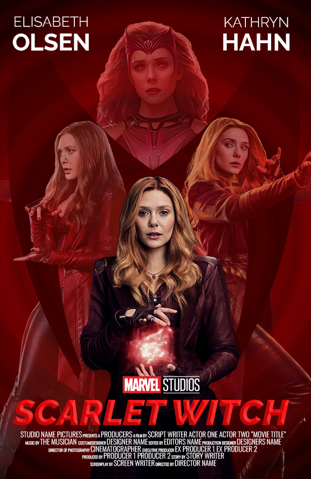
Movie Poster
Assignment:
Using your latest knowledge of typography and design principles, create 1-2 at 11 x 17″ Movie Posters at 300 ppi. The purpose of this exercise is to sharpen your understanding of the balance between graphics and titles in a composition.
For this exercise, you’ll be using Adobe Photoshop (optional: Adobe Illustrator and InDesign for other elements) Set up your document in Photoshop. Utilize layers and your art boards to create 2 different versions of the same poster. This difference can be typographic, image difference in color and color modes, blend modes or others. The key is to experiment and create two strong options for a potential client.
Incorporate your knowledge of:
- Selections
- Masking
- Lighting filters
- Blur Filters
- Blend modes
- Smart Objects
- Adjustment layers
- Image modes
- Typography
Remember the basics:
- Titles should not outshine the graphics
- Don’t italicize all caps
- Avoid cheesy stock Photoshop effects & filters on text
- Never stretch text
Dimensions: 11 x 17″ at 300 ppi
Applications used:
Adobe Photoshop
