- No products in the cart.
Web Ads Assignment

This week we worked on product ads for social media and websites. Our job was to use or create a product and design a cohesive ad campaign for the different dimensions that would be used on the different sites.
Size requirements:
Instagram Story: 1080 x 1920
Instagram grid: 1080 x 1350
General website: 300 x 250
Website (leaderboard): 728 x 90
GIF (not animated): 250 x 250
Brainstorming:
My idea was to create a fictional brand so that there would be no conflict with copyrights with these in my portfolio. I named my company “Your Cosmetics” which is self explanatory. I decided that we would be advertising our annual Spring Sale offering 40% off all skincare products.

Concept Development:
I had an idea of what I wanted my ads to look like so I chose a color palette and the typefaces that would work with my vision. I needed a typeface that complimented my logo, but I wanted a bold eye-catching font for the “Spring Sale” especially considering how small some of these ads were to be.

Concept Refinement:
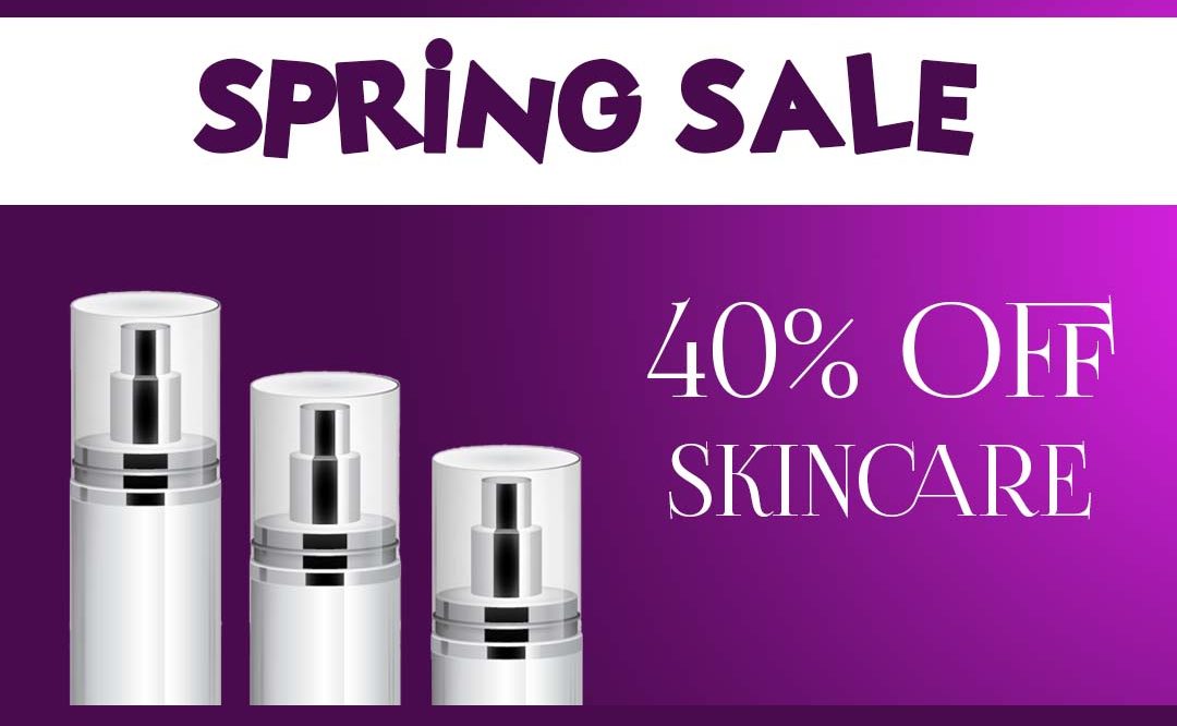
I created the multiple artboards I needed and began by adding all the elements I knew I would need on each board. That included the background color, company logo, and copy. I chose purple with a spotlight gradient coming in from the (stage) right. A rectangle banner would house the Spring Sale headline and the product would be featured underneath that. I also designed a call to action button that would be on the ad.

Next, I found a high resolution stock image of blank cosmetic bottles that would fit my theme perfectly. I masked those out in Photoshop, then I duplicated the image, reflected it, and lowered the opacity to create a reflection. It was a simple process and gave the ads a very professional finished look.

Also, because I’m always a little extra, I added the Instagram “swipe up” overlay that you frequently see amongst the stories, and the “shop now” box featured at the bottom of their grid ads.

Overall I was very pleased with the outcome, and enjoyed creating them.
